

Flexbox in CSS
In today’s fast-paced world of web design, creating responsive and flexible layouts isn’t just a nice-to-have—it’s a must. That’s where Flexbox, short for the Flexible Box Layout, steps in. Launched with CSS3, Flexbox has completely changed the game for developers by offering a robust, one-dimensional layout system that makes it a breeze to align and distribute space among items in a container. Unlike older layout techniques like floats or inline-block, Flexbox lets you design with the natural flow of content in mind, effortlessly adjusting to various screen sizes and orientations. Whether you’re crafting a navigation bar, a gallery, or a complex web app layout, Flexbox streamlines the process with clean, easy-to-read CSS. In this post, we’ll dive into how Flexbox works, break down its key properties, and provide practical examples to help you tap into its full potential for your web design projects.
Why Use Flexbox?
CSS has come a long way in recent years. Designers have really embraced the arrival of filters, transitions, and transforms. But there was still something we were all yearning for. The ability to create smart page layouts with CSS felt like it was taking forever, leading many of us to resort to some pretty messy CSS workarounds. We’ve all had to wrestle with floats, table display hacks, and the headaches they brought along. If you’ve been writing CSS for a while, you know exactly what I mean. And if you’re new to this, welcome to a much better experience! It seems our wishes as designers and front-end developers have finally been answered, and in a big way. Now we can finally say goodbye to those clunky CSS tricks. No more relying on floats or table-cell displays. It’s time to welcome a sleek, modern syntax for building intelligent layouts. Say hello to the CSS Flexbox model!
What Is Flexbox?
The Flexbox model is designed to make it super easy to layout, align, and distribute space among elements in your document, even if you’re not sure about the viewport size or if your elements are changing. If that sounds a bit too technical, don’t worry—I’ll break it down into simpler terms in just a moment. Whether you’re a CSS pro or just starting out, you’ll feel right at home here!
How do I start using the Flexbox model?
This is the first question that pops into everyone’s mind, and believe it or not, the answer is a lot simpler than you might think. To kick things off with the Flexbox model, all you really need to do is set up a flex-container first. Did I just make things more confusing? Let me break it down for you. In standard HTML, if you want to lay out a simple list of items, it looks like this:
<ul> <!–parent element–>
<li></li> <!–first child element–>
<li></li> <!–second child element–>
<li></li> <!–third child element–>
</ul>
If you glanced at that, you must have seen that the unordered list (ul)
houses the list elements(li).
You can think of the ul as the parent element and the li as the child element. To get started with the Flexbox model, you need to turn your parent element into a flex container (also known as a flexible container). You can do this by simply setting it to display: flex or display: inline-flex if you prefer the inline version. It’s really that straightforward, and once you do that, you’re ready to dive into using the Flexbox model!
Using an unordered list and a bunch of list elements, below is what
initiating a Flexbox formating context looks like.
/*Make parent element a flex container*/
ul {
display: flex; /*or inline-flex*/ }
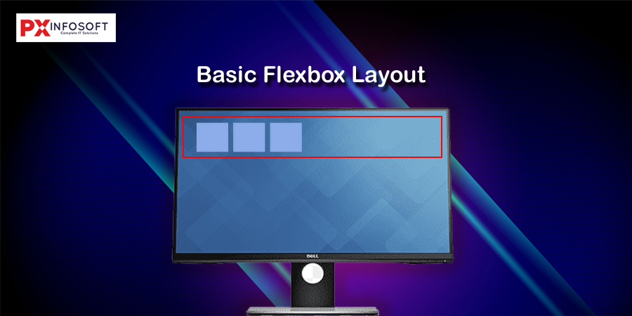
Style the list items just a bit, so you may see what’s going on here.
li {
width: 100px;
height: 100px;
background-color: #8cacea;
margin: 8px; }
Here is what you should have.
Basic Flexbox Layout
Understanding the Main and Cross Axis
Flexbox layouts are based on two axes:
- Main axis – The primary direction in which flex items are laid out. (Default: horizontal/row)
- Cross axis – Perpendicular to the main axis (Default: vertical/column)
.container {
display: flex;
flex-direction: row; /* default */
/* or column, row-reverse, column-reverse */
}
Basic Alignment Properties
Flexbox gives you powerful control over alignment using these properties:
1. justify-content (alignment along the main axis)
.container {
justify-content: flex-start; /* default */
justify-content: center;
justify-content: flex-end;
justify-content: space-between;
justify-content: space-around;
justify-content: space-evenly;
}
2. align-items (alignment along the cross axis)
.container {
align-items: stretch; /* default */
align-items: flex-start;
align-items: center;
align-items: flex-end;
align-items: baseline;
}
3. flex-wrap (control wrapping of items)
By default, Flexbox tries to fit all items into one line. To allow wrapping:
.container {
flex-wrap: wrap;
/* or nowrap (default), wrap-reverse */
}
You can also combine flex-direction and flex-wrap with the shorthand:
.container {
flex-flow: row wrap;
}
Basic flexbox layout
Code
Vertical Flexbox Layout
Code
hj